
1/4 Blue Grid Cloth
A reinforced diffusion material that raises the Kelvin temperature of a light source.
1/4 Grid Cloth
Similar characteristics to Grid Cloth, but less dense. Can be sewn and grommetted.
1/4 Straw Grid Cloth
A reinforced diffusion material that lowers the Kelvin temperature of a light source.
7 Cyan
Photographic lighting filter equal to CC07C. Enhances blue and green transmission by effectively reducing red exposure by 1/4 stop. Heat
Alice Blue
A rich clean red blue that warms to lavender when dimmed.
Amber Cyc Silk
A secondary color combined with 104 Tough Silk.
Apricot
A rosy amber which produces a romantic sunset color. Useful as sidelight or backlight color.
Aquamarine
A pale blue-green color. Can be used for area lighting. A soft backlight color.
Azure Blue
A clean slightly green blue. Good moonlight fill.
Baldassari Blue
Saturated color created for Lighting Designer Mike Baldassari. It’s Double #3220 Double Blue.
Bastard Amber
Good where a tint of color is needed. Excellent for natural skin tones.
Belladonna Rose
Powerful magenta-purple. Good effects filter for dance.
Bermuda Blue
A soothing green blue. More blue than 76. A good conventional moonlight color. Interesting tonal color.
Billington Pink
Billington Pink
Black Scrim
A perforated material that is balck on both sides. Used as a Neutral Density Window Scrim. Reduces incident light level
Blue Bell
A clean light red blue. Creates naturalistic daylight fill color. Good cool area light.
Blue Cyc Silk
Useful in border and striplights to prevent scalloping; helps illuminate cycs and drops.
Blue Diffusion
Combine a color with Matte Diffusion. Aids in broad, even illumination of cycs and drops.
Blue Green
Useful for mood of mystery and for toning scenery that has been spattered in blues.
Blush Pink
A pink tint that is excellent for most skin tones. A good color for warm area lighting. Lighter than 33.
Booster Blue
Helps maintain white light when dimmer is at low intensity.
Bright Blue
Cool clear bright blue.
Brilliant Blue
Used for dramatic moonlight effects.
Broadway Pink
A deep, saturated pink created for musicals and specials. Excellent for down and backlighting.
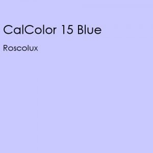
CalColor 15 Blue
Very pale blue tint with a hint of red. Nice no-color definition when crossed with 51.
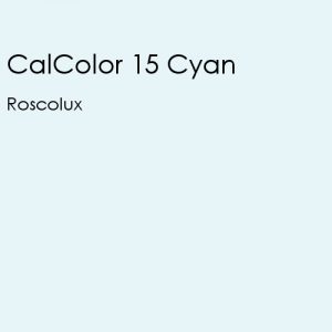
CalColor 15 Cyan
Very pale blue green. Interesting industrial daytime skies. Use with caution on skin tones.
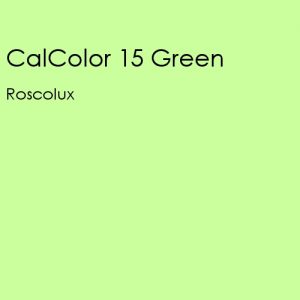
CalColor 15 Green
Pale, balanced green without yellow tones. Nice for leaf breakups and foliage washes.
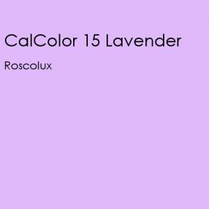
CalColor 15 Lavender
Pale no color lavender. Slightly cooler than 351. Tones without adding color.
CalColor 15 Magenta
Pale Magenta. Cooler than 3318. Useful on many skin tones.
CalColor 15 Pink
Between 33 and 333. Excellent on all skin tones. Not as cool as 333.
CalColor 15 Red
Very pale red. Subtle warming on skin tones. Warmer than R05
CalColor 15 Yellow
Very pale yellow. Interior lighting to create industrial mood.
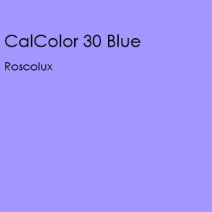
CalColor 30 Blue
Double 4215. Pale blue with reddish cast.
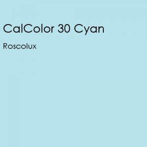
CalColor 30 Cyan
Double 4315. Slightly greener than “normal” daylight. Uncomfortable skylight.
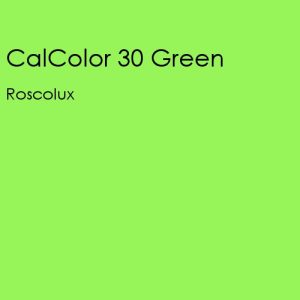
CalColor 30 Green
Double 4415. Golden green wash. Less saturated but strong, balanced green. Excellent for exterior landscaping.
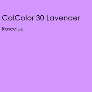
CalColor 30 Lavender
Double 4915. Excellent cool on skin tones. Nice warm tones during nighttime.